What Makes a Casino Scene Recognizable Before a Single Card Appears?
Before a dealer reaches for the deck, a casino scene has usually made its introduction. A sweep of patterned carpet, a gleam from a chandelier, the low glow over a table: these details tell us where we are and what kind of evening the scene intends to offer. Casino imagery works because it is built from a visual vocabulary audiences already know—not because every casino looks the same, but because certain design cues suggest ceremony, chance and focused attention.

That vocabulary travels between grand hotel interiors, film sets, live studio broadcasts and the small screens of phone browsers. The challenge is to make the setting legible at each scale. A room can use architecture and movement to build atmosphere; a mobile presentation has to choose its details with more care. In both cases, the scene needs to communicate quickly without turning every surface into decoration.
A visual vocabulary, not a dress code
Casino glamour is often reduced to a familiar image: a sharply dressed guest, a polished table, a sparkling room. That shorthand can be useful, but it is not a rulebook for what people should wear or how they should behave. Movie casinos are styled environments, not instructions for a night out. Their visual cues tell an audience how to read a scene, rather than setting a standard for real guests.
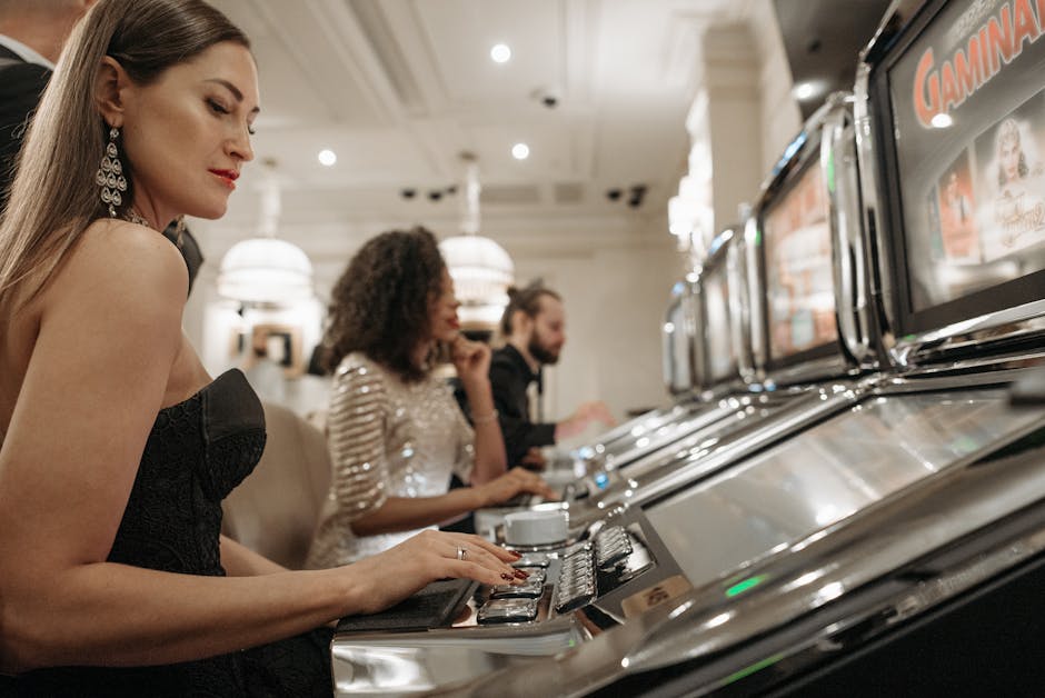
The elegantly dressed figure cue is one example. In a film or advertisement, a poised figure in a tailored jacket or evening dress can quickly suggest an occasion. The clothing may contrast with the room’s darker surfaces or catch a little light as the person moves. But the cue is strongest when it supports the composition rather than demanding attention for its own sake. A character’s silhouette, posture and direction of travel can be as telling as the clothes.
Other familiar cues include repeated table shapes, a visible dealer, reflected highlights and a deliberate path through the space. None has to appear in every scene. Their value lies in how they combine. A single green felt surface may read as a generic tabletop; placed beneath focused gaming table lighting, with chairs arranged around it and a clear view of the dealer, it becomes more specific.
The Casino de Monte-Carlo offers a particularly recognizable reference point because its historic setting connects gaming with architecture, ceremony and an established sense of place. The point is not that every casino should imitate it. Rather, it shows how a strong identity can come from the relationship between a room’s details and its larger story. A landmark interior can signal occasion before the gaming floor itself comes into view.
Interior design that creates occasion
A casino interior does more than hold tables and chairs. It shapes the pace of arrival, offers places to pause and directs attention toward the activity at hand. Materials and finishes contribute to that feeling, but they work best in context. Deep colors and polish can suggest formality when balanced with legible surfaces and comfortable routes through the room. Used everywhere, they can make an interior feel heavy or difficult to read.
Polished stone, dark timber, metal trim and glass all behave differently under changing light. A glossy surface can extend a highlight across a wall or floor; a softer finish can keep attention on a guest or table. Pattern can make a floor memorable, but it should not obscure circulation. If a decorative feature takes up visual or physical space without helping people understand where to go, it is decoration at the expense of usability.
Designers also create occasion through contrast. A calm entry may open onto a more active gaming floor. A brighter bar can sit beside a quieter lounge. A sequence of smaller spaces can build anticipation more effectively than one room filled with equally emphatic features. The transition tells visitors that they have moved from one part of the experience to another.
That change need not depend on opulence. A room can feel considered through proportion, texture, acoustics and the placement of furniture. In hospitality design, a comfortable seat in the right place can matter more than another decorative fixture. The best environments allow a guest to understand the room without having to decode it.
Visual hierarchy: what the eye sees first
Every recognizable scene has a hierarchy. Some details catch the eye immediately; others reward a closer look. In a casino setting, the main points of attention might be a table, a central chandelier, a bar or a person entering the room. The composition becomes confusing when too many elements compete at once.
Lighting helps establish that order. Focused gaming table lighting can make a table feel like a destination within a larger room, while surrounding areas remain softer or less visually assertive. A clear pool of light also makes the activity easier to follow in a broadcast or a close-up. The goal is not simply brightness. It is to make the important action distinguishable from the background.
Reflection can reinforce a hierarchy, too. A small glint on glassware or a metal edge can add precision; a whole field of reflections can flatten the scene into visual noise. Likewise, a patterned carpet may add identity when viewed in a wide shot, but it can compete with faces and hands if its contrast is too strong. The question for a designer or art director is not “Can we add another detail?” but “What does this detail help the viewer notice?”
Movement matters as much as composition. A guest crossing a room gives the eye a route to follow. A server moving between a lounge and a table can reveal how the spaces connect. Even a slow camera move can show scale, establish a point of view and guide attention from architecture to activity. When everything in a scene is static, ornate surroundings can feel like a display rather than a place people use.
How a room guides movement
In a physical interior, circulation should be evident without relying on signs alone. Tables, seating and columns can help define a route, but they should not create a maze. A guest should be able to see an inviting destination and understand how to reach it. In a visual composition, the same principle applies: the viewer needs a readable path through the frame.
That path might begin at an entrance, continue toward a central table and end at a figure in conversation. It can be created with sightlines, changes in floor material or a sequence of lights. These are not merely decorative gestures. They organize attention and help the audience understand the room’s geography.
Live studio broadcasts make that organization especially visible. A camera has limited time to establish a setting before it turns to the host, dealer or game. Set teams therefore balance an identifiable backdrop with clear working space, useful camera angles and unobstructed views. The room must read as a casino, but the visual framing also has to serve the people on camera and the audience watching at home.
From grand room to phone browser
The same scene can behave very differently on a cinema screen, in a live studio broadcast and in a phone browser. On a large display, viewers can take in architectural depth and small background details. On a phone, the frame is narrower, the viewing distance may be short and the interface itself occupies part of the screen. Selectivity becomes essential.
For phone browser access, the presentation should be clear without requiring a dedicated app download. That convenience is practical, but it also puts pressure on the design: key information needs to remain readable within a compact interface. A decorative flourish that works across a ballroom wall may become a distracting sliver on a small display. Details have to earn their space.
Mobile design benefits from a clear order of importance. A viewer should be able to identify the main action, see relevant controls and understand what is happening without hunting through competing visual elements. Deep colors can give a screen a composed, distinctive character, but contrast and legibility still matter. Fine textures, tiny ornament and elaborate framing may disappear or become clutter when scaled down.
Brands such as MrQ live casino studio vs land casino operate in a digital environment where the presentation has to make sense on the devices people actually use. That means atmosphere cannot depend only on intricate room detail. A strong focal point, consistent use of color and a clean reading order can carry more weight than a miniature version of a grand interior. The screen does not need to reproduce every feature of a physical casino to suggest a gaming setting.
Selective detail is not the same as stripping away character. One well-chosen reference—a line of table lights, a recognizable felt surface, a restrained metallic accent—can do more than a crowded collection of visual effects. On a small screen, clarity is part of the atmosphere. If the viewer can follow the scene comfortably, the design has room to feel intentional.
Why familiar cues keep working
Casino imagery is often discussed as spectacle, but recognition depends on a practical combination of cues: a focal point, an understood route, materials that catch light, and people arranged around a shared activity. A room’s history or location can add another layer. Coverage by CNA Luxury (Channel NewsAsia), for example, can place a hotel or hospitality interior in a broader conversation about design, culture and the experience of place. That context helps explain why a room feels distinctive without treating decoration as a substitute for purpose.
For designers, producers and digital teams, the useful question is not how to make a scene look “more luxurious.” It is how to make the scene readable, specific and comfortable at the scale where it will be experienced. That requires choices about what to show, what to leave out and where to direct attention.
Visual cue What it communicates What to watch for Focused table lighting Where the action is centered Too much brightness can flatten the surrounding room Deep colors and polish A composed, formal mood Overuse can make surfaces compete or feel heavy Distinctive figures and silhouettes Scale, social energy and occasion Wardrobe should not be treated as a real-world dress code Clear routes and sightlines How people move through the space Furniture or ornament should not obstruct circulation Selective mobile detail Identity at a small screen size Fine decoration can turn into clutter or disappearRecognition before the cards
A casino scene becomes recognizable before any card appears because the room has already done the storytelling. Its lighting identifies a focal point; its layout suggests movement; its surfaces establish tone; and its people give the space scale and purpose. The most convincing scenes do not pile on every available symbol. They choose a few cues and let them work together.
That principle holds in a landmark interior, on a studio set and in phone browser access. Scale changes what can be seen, but not the need for hierarchy. Whether a scene leans on the elegant figure, the table’s pool of light or a distinctive architectural detail, the aim is the same: make the setting immediately legible while leaving people room to look, move and take part.