What Should a Good Mobile Entertainment App Layout Include?
A good mobile entertainment app layout helps people find something enjoyable quickly, understand what it will cost, and use the app comfortably on the phone they already have. That matters especially in the Philippines, where many people access entertainment through mobile data and a wide range of Android devices. A layout that looks polished on a large, fast phone may still feel crowded or slow on a smaller, older one.
The best layouts start with a simple question: what does someone need to see and do in the first few seconds? Clear navigation, touch-friendly buttons, and readable text on small screens are essential. So are familiar patterns, direct entry points for repeat visits, and clear information about prices, fees, and deposits where applicable. These details can make the difference between an app that feels easy to return to and one that leaves people guessing.
Design for mobile-first access in the Philippines
Mobile-first design means more than shrinking a desktop page until it fits a phone. It means planning around a small screen, one-handed use, variable connection speeds, and different device capabilities from the beginning. Entertainment apps should keep the main task visible without making people scroll through a wall of promotions, cards, or tiny controls first.
Test layouts on smaller Android screens as well as newer models. Check whether the most important labels fit without awkward wrapping, whether buttons are easy to tap, and whether key content remains visible when the keyboard or system navigation takes up space. A design that works only on a large screen can force users on more modest devices to zoom, hunt, or tap repeatedly.
- Put the main action near the center or lower part of the screen, where it is easier to reach with one hand.
- Keep important text and controls away from screen edges, notches, and system bars.
- Use images efficiently so pages are not needlessly heavy on mobile data.
- Make loading, offline, and connection states understandable instead of leaving blank areas.
Good mobile-first access also means showing people where they are. A clear page title, a visible back option, and an obvious path to the home screen help users recover when they open the wrong section or follow a link into the app. These basics are especially useful when people arrive from a search result, a message, or a social post rather than opening the app from its home screen.
Make navigation clear and predictable
Clear navigation reduces the effort between opening an app and reaching the desired content. Use familiar labels that describe the destination, such as “Home,” “Games,” “News,” or “Account,” rather than clever names that require interpretation. Keep the number of primary choices manageable, and avoid placing several competing menus on the same screen.
Navigation should also behave consistently. If tapping a bottom tab opens a section, tapping it again should not unexpectedly reset the app or take the user somewhere unrelated. Back actions should return to the previous sensible screen, and selected tabs should have a visible state so people know what is active.
Count the taps to the main destination
For common tasks, count how many taps it takes to get from the home screen to the content people came for. A repeat visitor should not have to open several menus, dismiss multiple banners, and scroll past unrelated material every time. Reduce unnecessary steps, but do not hide important details just to make the path look shorter.
For example, someone exploring the BingoPlus experience may want a direct route to the relevant play area. A reference such as bingoplus.com/play/bingo_plus can serve as a direct entry point, provided the destination is clear and the link works well on mobile. The label around a link should explain where it leads; a bare URL is rarely enough guidance.
Direct entry points can also help content-focused services. A user who opens DGM News to read a particular story should be able to reach the article from a shared link, then return to the appropriate section without losing their place. The same principle applies to a Bingo Plus app: make the path from a notification or saved shortcut to the intended feature direct and understandable.
Use touch-friendly buttons and controls
Touch-friendly buttons are large enough to tap accurately without making users aim at a tiny icon. Leave space between controls, especially when two actions have different consequences, such as “Continue” and “Cancel.” A crowded row of small buttons may save screen space, but it increases accidental taps and frustration.
Do not rely on color alone to communicate what a control does. Pair an icon with a short label when its meaning may not be obvious, and use clear visual states for pressed, selected, disabled, and loading controls. For actions that take time, show feedback so users do not tap repeatedly and wonder whether anything happened.
Layout element What users need Common problem to avoid Primary buttons A clear label, comfortable tap area, and visible response Small controls with vague labels such as “Go” Navigation Familiar names and a clear indication of the current section Hidden menus that contain essential destinations Body text Readable sizing, adequate contrast, and short paragraphs Tiny text or long blocks that are hard to scan Payment information Prices, fees, and applicable deposit amounts shown before commitment Costs revealed only after several stepsMake text readable on small screens
Readable text on small screens is a usability requirement, not a finishing touch. Use a legible font size, strong contrast between text and background, and enough line spacing to keep paragraphs from feeling dense. Avoid placing important instructions over busy images or using pale text that disappears outdoors in bright light.
Write for scanning. Put the main point first, use short paragraphs, and give buttons labels that describe the action. A person glancing at a screen during a short break should be able to understand what a section offers without reading several paragraphs. If instructions are essential, place them close to the relevant control instead of burying them in a separate help page.
Check text at the actual size it will appear on a phone, not just in a design mock-up on a laptop. Look for clipped labels, unexpected line breaks, and messages that disappear bingo plus verification code not received behind fixed navigation. Also consider users who increase their device’s text size; a flexible layout should adapt rather than overlap or cut off content.
Design for short sessions and low attention time
Many people open entertainment apps for a few minutes between other activities. The layout should make a short visit worthwhile: show relevant content quickly, preserve useful context, and make it easy to leave or resume later. Avoid making every visit begin with the same full-screen promotion or a long sequence of screens before the user can reach the main experience.
Prioritize what matters now. A home screen might show a clear next step, a small number of relevant recommendations, and useful updates. Secondary offers and less-used settings can remain available without competing with the primary task. If a user dismisses a message, do not immediately show it again in another format unless there is a meaningful reason.
Short sessions also make clear feedback important. Confirm when an action has completed, show progress during loading, and explain what to do when a connection fails. Avoid unhelpful messages such as “Something went wrong” without a next step. A better message identifies the issue in plain language and, where appropriate, offers a specific action like checking the connection or returning to the previous screen.
Keep the experience familiar across updates
Regular updates can improve an app, but familiar UI helps people keep using it without relearning basic tasks. Keep core navigation in stable places, retain recognizable labels, and make changes gradually when possible. If a major change is necessary, explain it briefly in context and provide a straightforward way to find common features.

Consistency should extend across screens, not just across versions. Similar buttons should look and behave alike. Error messages should use consistent wording, and the same action should not be called “Join” on one screen and “Enter” on another unless the distinction is clear. Small inconsistencies add up, especially for people using the app in short bursts.
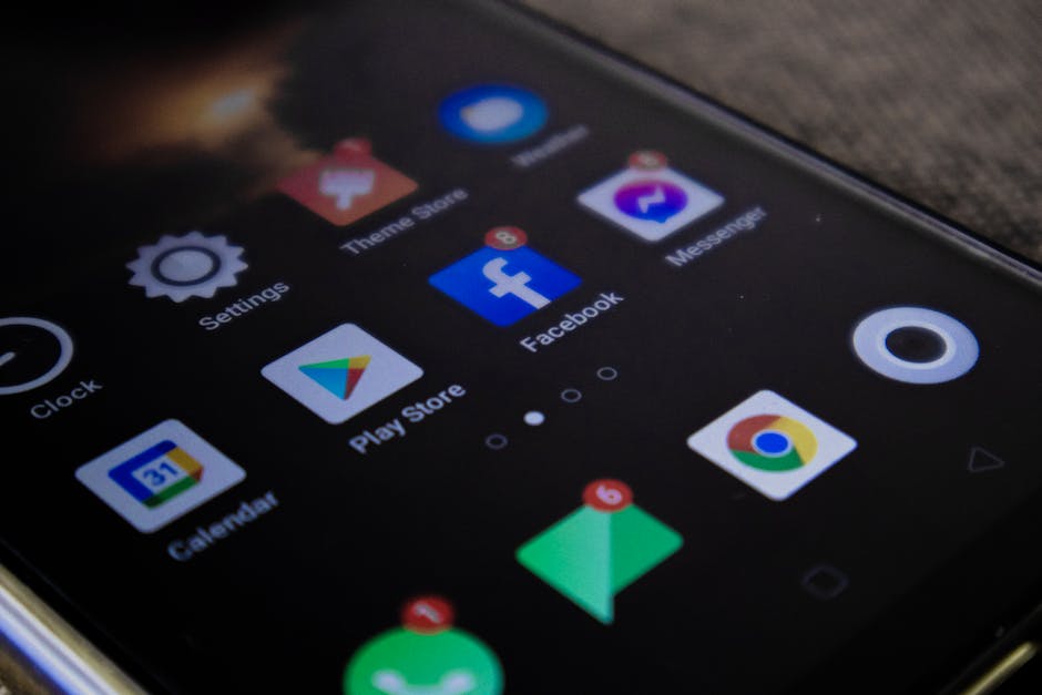
Before a rollout, test key journeys on a smaller phone and with a slower connection. Check the exact wording of error messages, confirm that links open the intended destination, and verify that important controls remain visible. Updates should improve the experience without surprising people who rely on familiar entry points.
Be transparent about pricing, fees, and deposits
A common and costly layout mistake is showing no pricing, fees, or deposit amounts until late in the process. If an app includes purchases, paid features, or deposits, people should be able to understand the applicable costs before they commit. Do not make users search through several screens or start a transaction just to learn the amount.
Present costs in plain language and close to the relevant action. Explain what a fee applies to, whether an amount is optional or required, and whether terms may vary. If prices or deposit options depend on the selected method, say so before the user makes a choice. Keep the information readable and avoid hiding it in faint text, a crowded footer, or a long terms page alone.
- Show the amount before the final confirmation step.
- Explain any fees in the same section as the related price or deposit.
- Use clear labels for optional purchases and recurring charges, if applicable.
- Make the confirmation screen easy to review before a user proceeds.
Transparency supports trust and helps prevent accidental spending. It is also part of good navigation: users should not need to guess what a button will cost them. For entertainment apps that include free and paid experiences, distinguish them clearly so people can make an informed choice.
Make sharing and returning easy
Sharing can bring people back to a specific piece of content or feature, but the shared destination needs to make sense on a phone. A Facebook share action should be easy to find when relevant, use a clear label, and let users understand what they are sharing before the external app or browser opens. After sharing, provide a sensible route back to the original experience.
Support repeat visits with bookmarks, recent activity, or direct links where they genuinely help. Keep notifications useful and explain why they matter. Instead of a generic alert, identify the update or event and make the destination clear. Avoid sending frequent messages that do not lead to something useful; people may turn notifications off if they feel like noise.
A practical mobile layout checklist
- Start with the main task: Make the primary destination visible without unnecessary scrolling or menu hunting.
- Check the tap path: Count the taps needed for common tasks, especially for repeat visitors.
- Test small screens: Confirm that navigation, text, and buttons remain clear on compact Android devices.
- Keep costs visible: Disclose relevant pricing, fees, and deposit amounts before commitment.
- Preserve familiar patterns: Keep core controls consistent across sections and updates.
- Explain system feedback: Make loading, connection problems, and completed actions easy to understand.
- Review shared and direct links: Make sure they open the expected destination and offer a clear way back.
Conclusion
A strong mobile entertainment layout is easy to understand at a glance and comfortable to use in a short session. It puts clear navigation first, uses touch-friendly buttons, and keeps text readable on small screens. It also respects the realities of mobile-first access in the Philippines: varied devices, limited screen space, and the need to reach useful content without wasting time or data.
Whether someone is exploring BingoPlus, opening the Bingo Plus app, or reading DGM News, the same foundations apply. Give people direct entry points, keep familiar controls consistent, explain costs before they commit, and make every tap feel predictable. When the layout answers the user’s immediate questions, returning becomes easier—and the experience feels more trustworthy from the first screen onward.